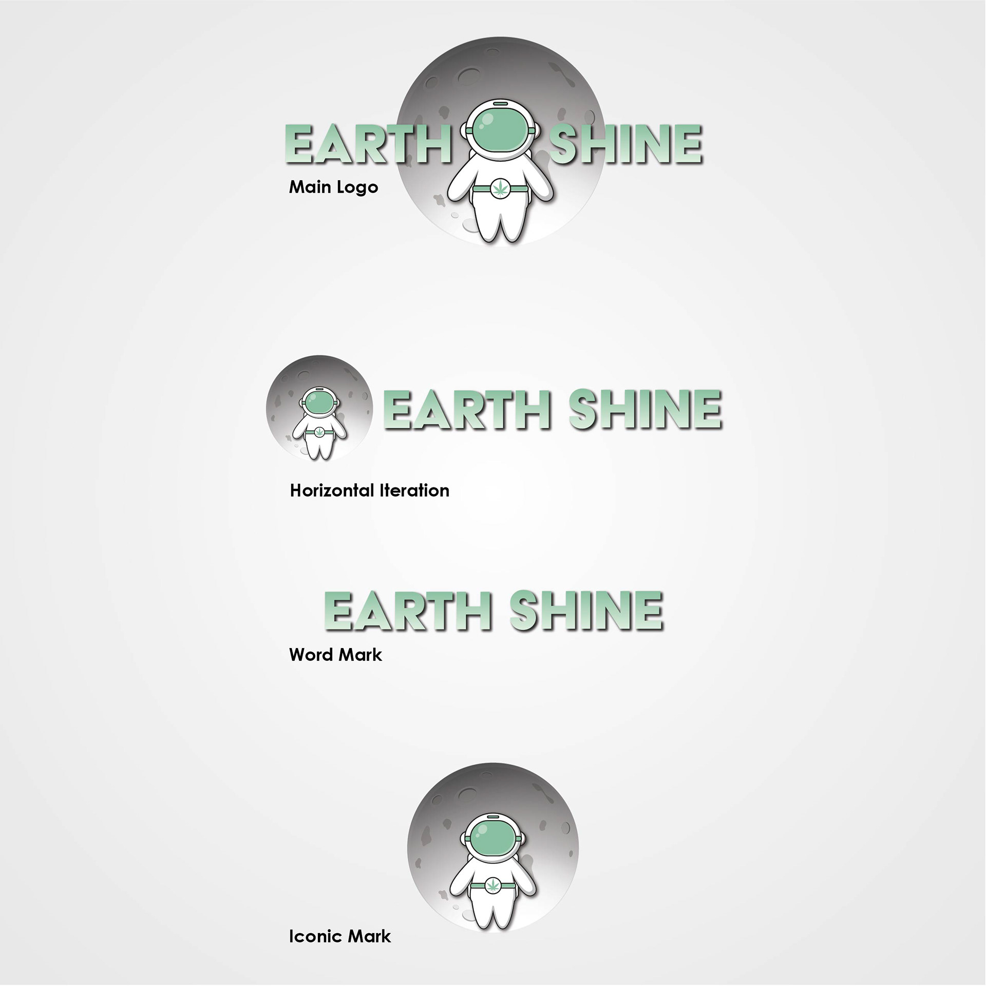

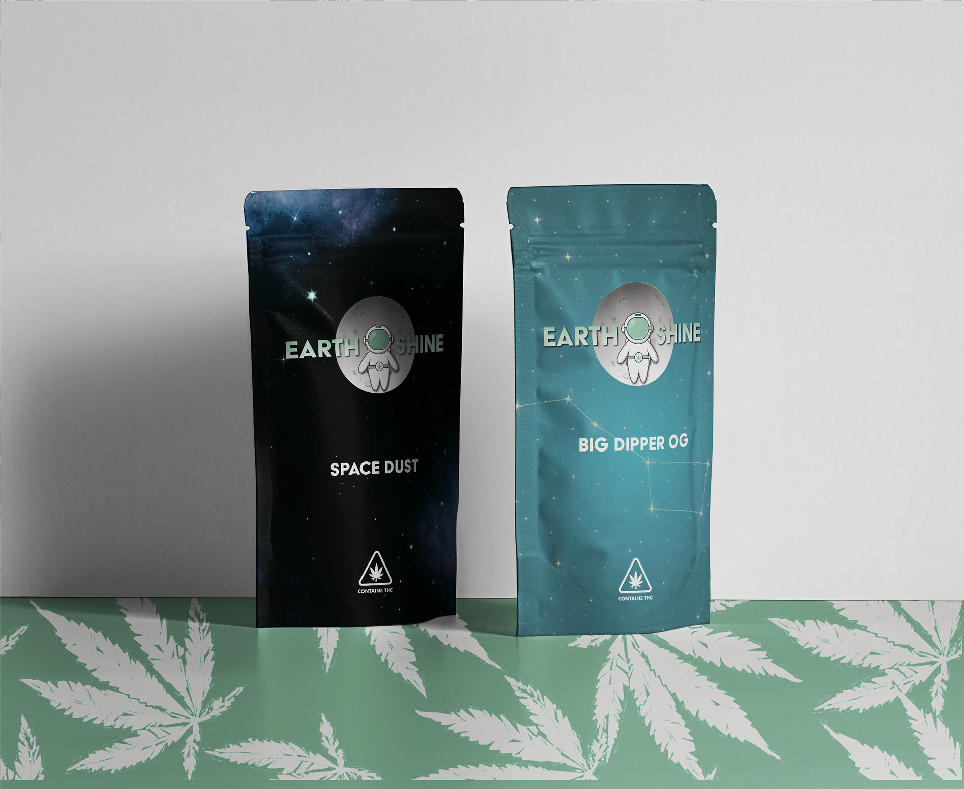
Earth Shine Marijuana Dispensary
I was tasked to create an artificial company with a futuristic-like theme. One of the first things that comes to mind when I hear the word "futuristic" is space. The company is a dispensary called Earth Shine, which means the dull glow that affects the unlit part of the moon created by sunlight reflecting from the earth.
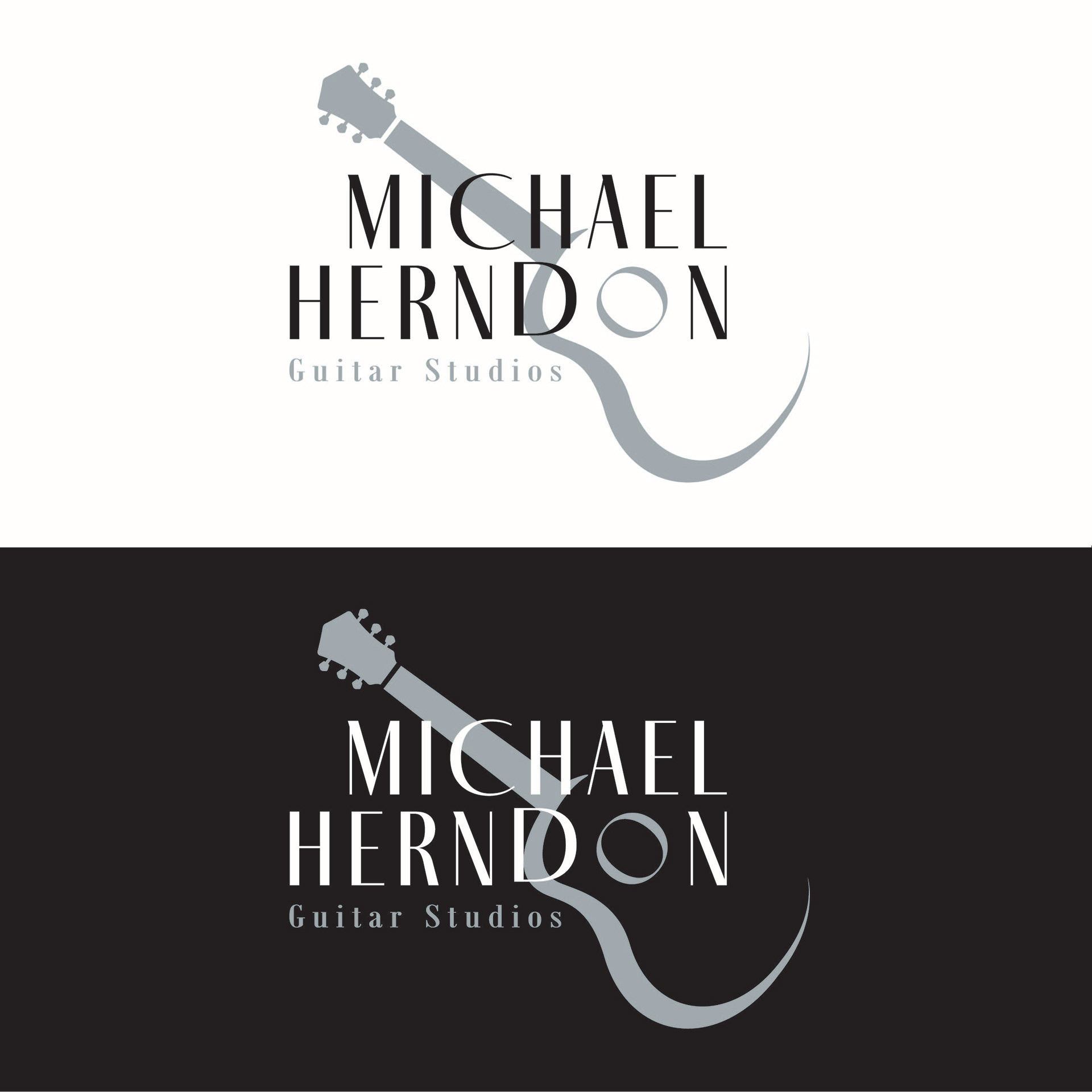
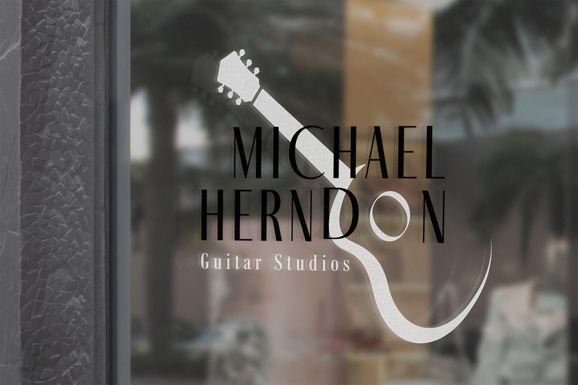
The goal behind this logo was to be literal in imagery, while creating a clean and classy feel. Michael teaches guitar (acoustic, classical, electric, bass) and ukulele. His expertise especially lies in the classical guitar which is also his favorite style to perform.
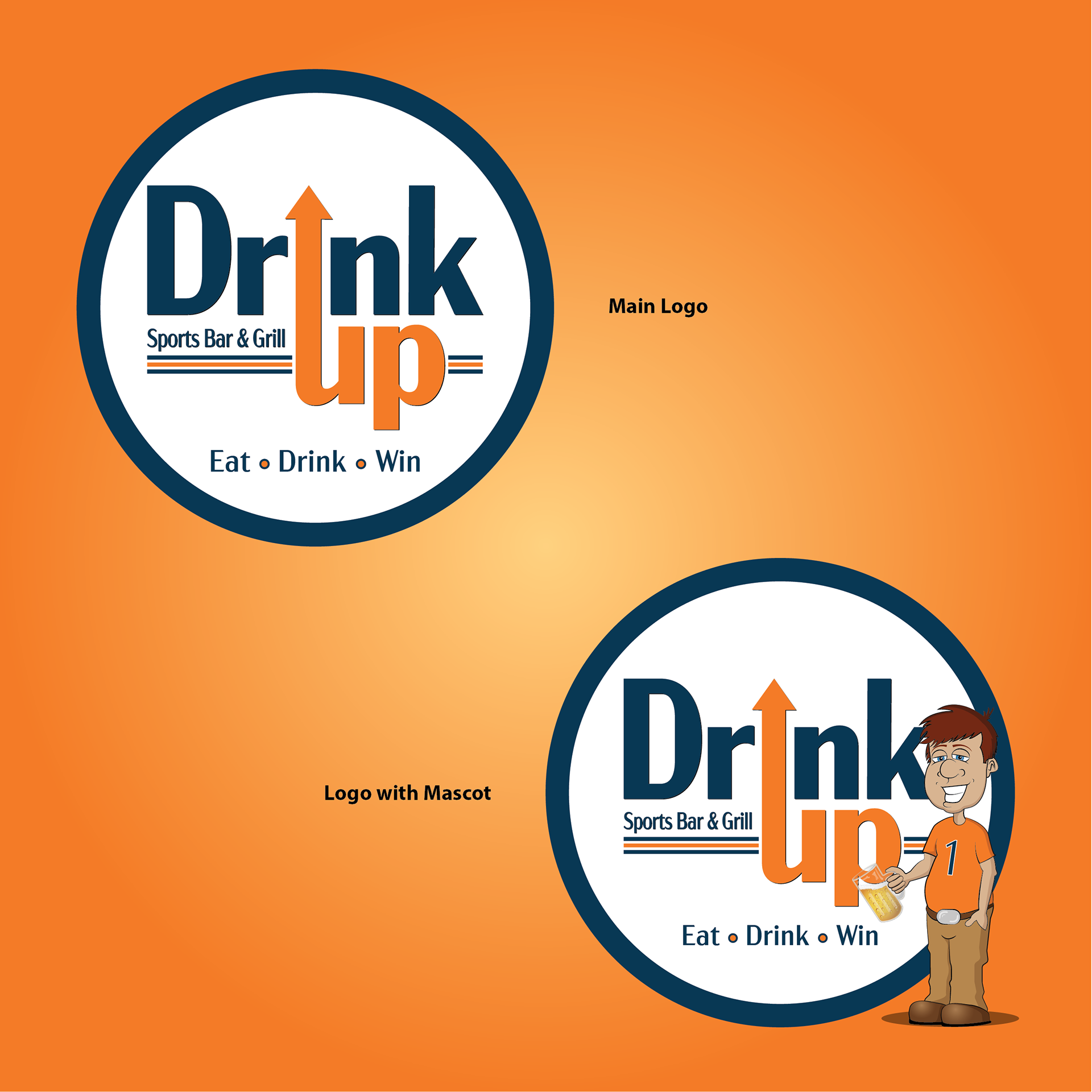
Drink Up Sports Bar and Grill
The theme of this logo revolves around the sports bar genre and more specifically a Chicago Bears themed bar and grill. This establishment has massive TV’s all over for the main sporting events such as PPV, NFL Sunday, local sports casts, Super Bowl party, World Series party, etc.
Sports fans of all ages are welcome. The bar portion is geared to the adult patron, but the restaurant as a whole is welcome to all families.
DeCaro Import
My professor obtained a client who was looking to rebrand his logo and business card design. The company specializes in food and wine imports from mainly Spain & Italy. The client agreed to have all 18 students in the class create a new design from which he could choose.
I am extremally happy to say this design is the one the client chose and will now represent his brand moving forward.
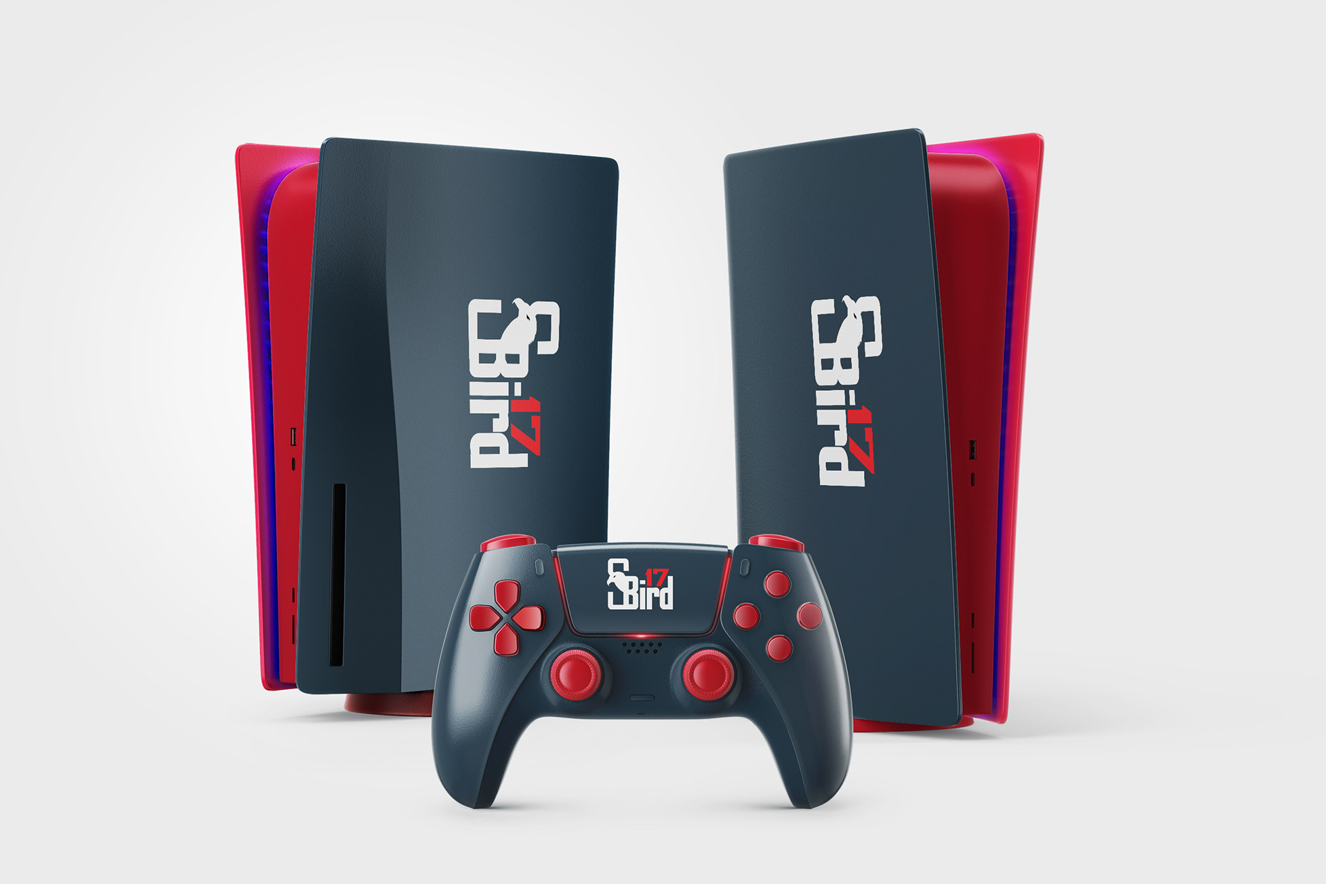
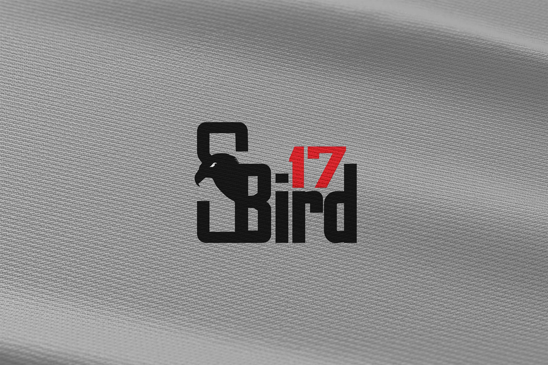
Gamer Tag: SBird17
This was a very straight forward project. The goal of the design was to combine the name of the tag with bird imagery. I created an eagle head silhouette to blend in with the text and chose a font that gives a technology vibe.
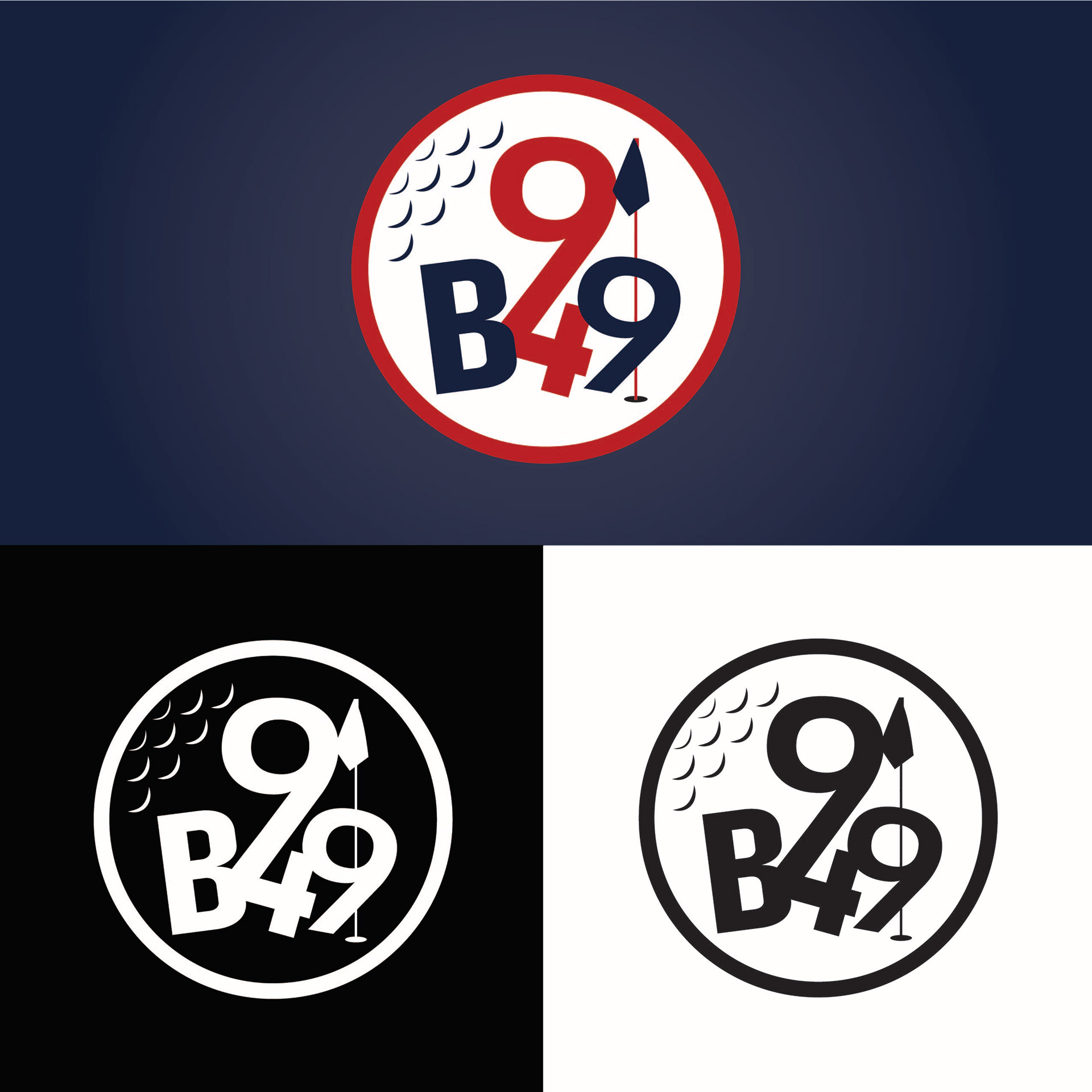

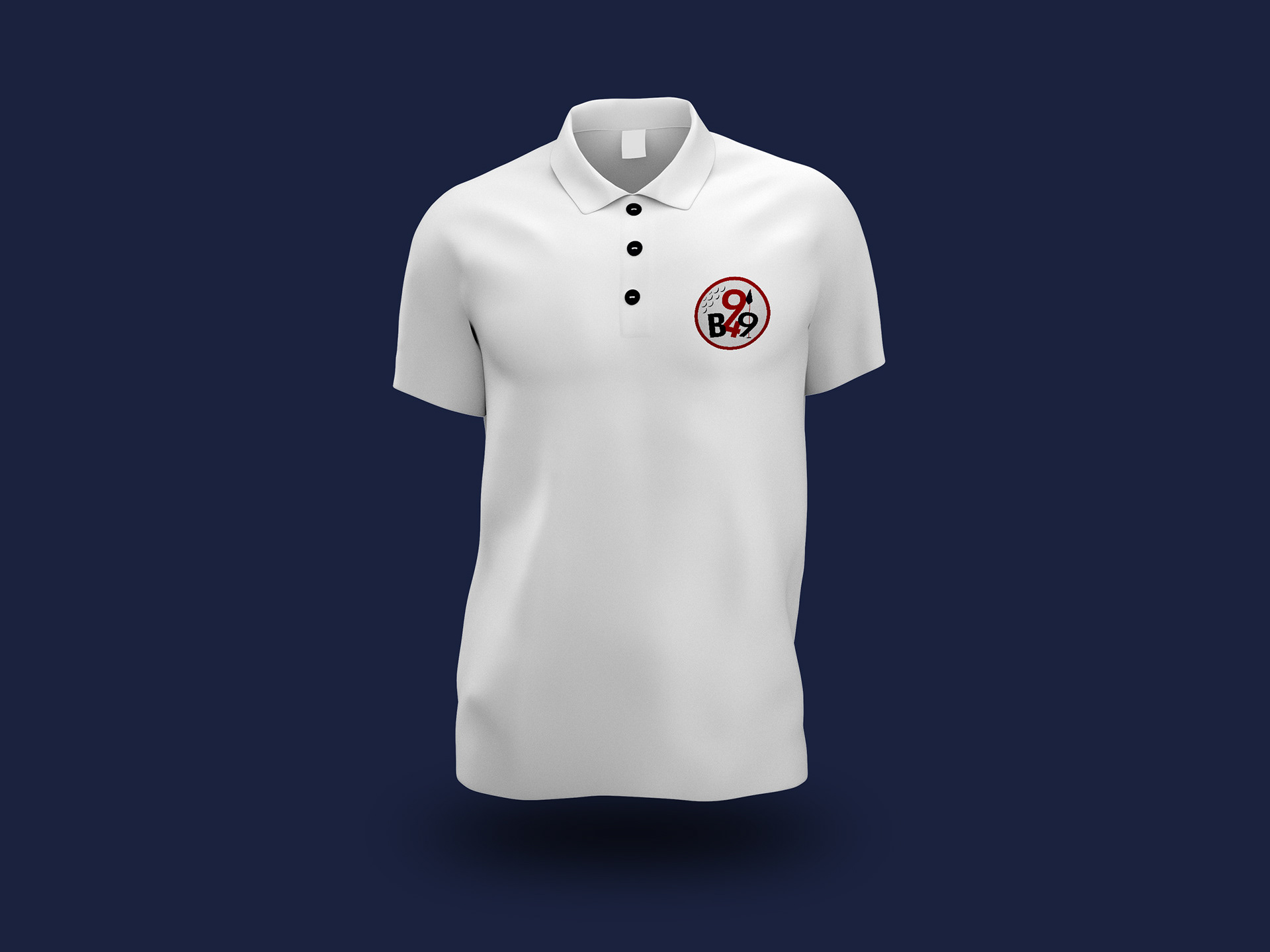
9 B4 9 Golf League
This is a neighborhood golf league in the NW suburbs of Illinois. The league is called 9 B4 9 because they play 9 holes before 9 AM every Sunday during golf season.
This logo is now used on shirts, hats, water bottles, etc.
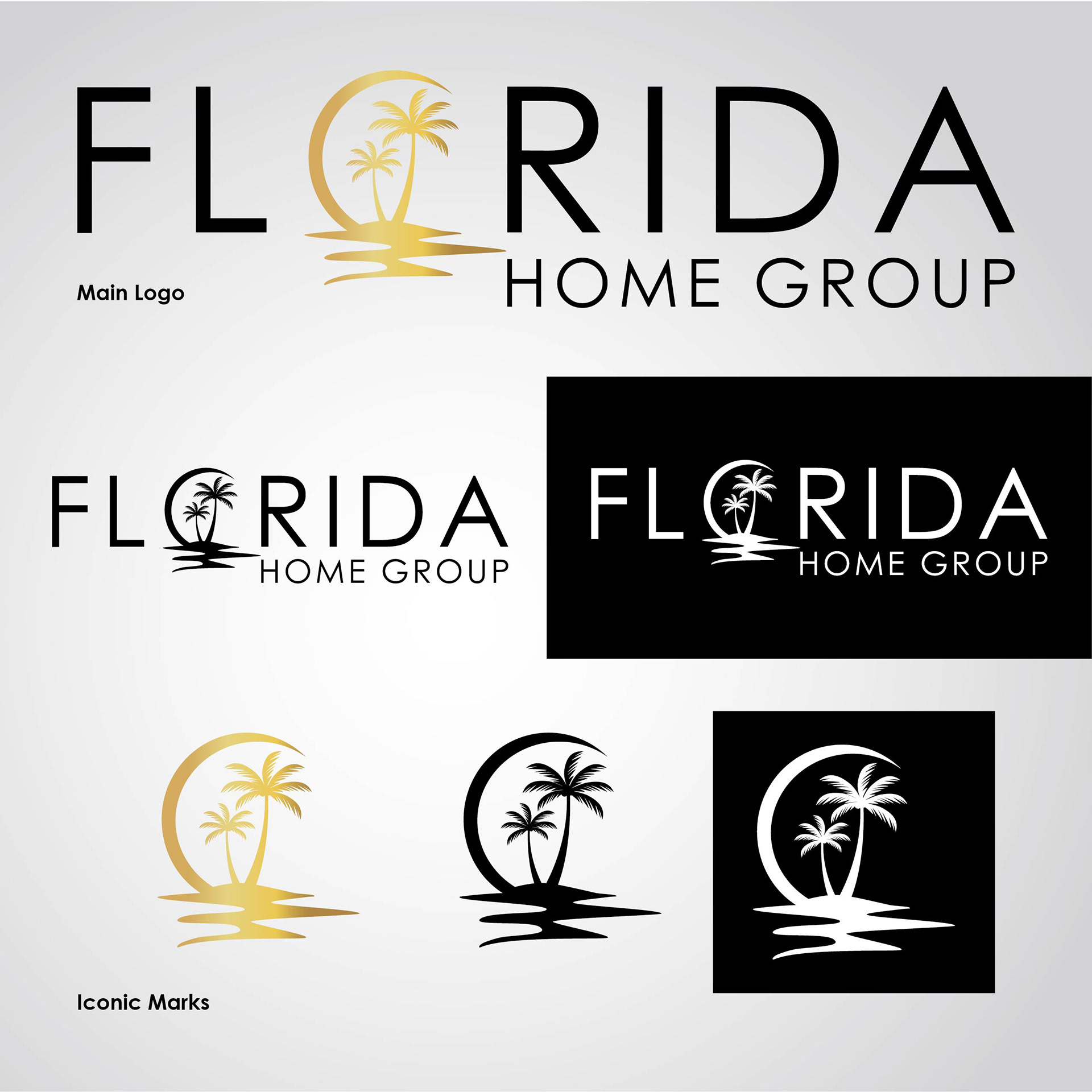

This is a real-estate group based in Lakewood Ranch, FL and services the entire state. The client wanted the logo to feel classy, with a Florida ambiance. I turned the letter "o" in Florida into a sunset motif which gives it a "Sunshine State" feel. Then I chose a thin, clean font and bumped up the kerning a touch to exude a classy look. Lastly the client requested the imagery have a gold gradient to encapsulate a luxury vibe as well.
