Ravinia Musical Festival Poster Contest
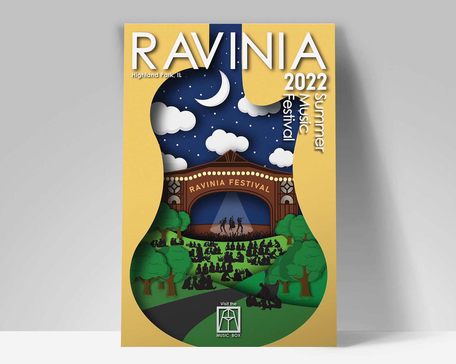
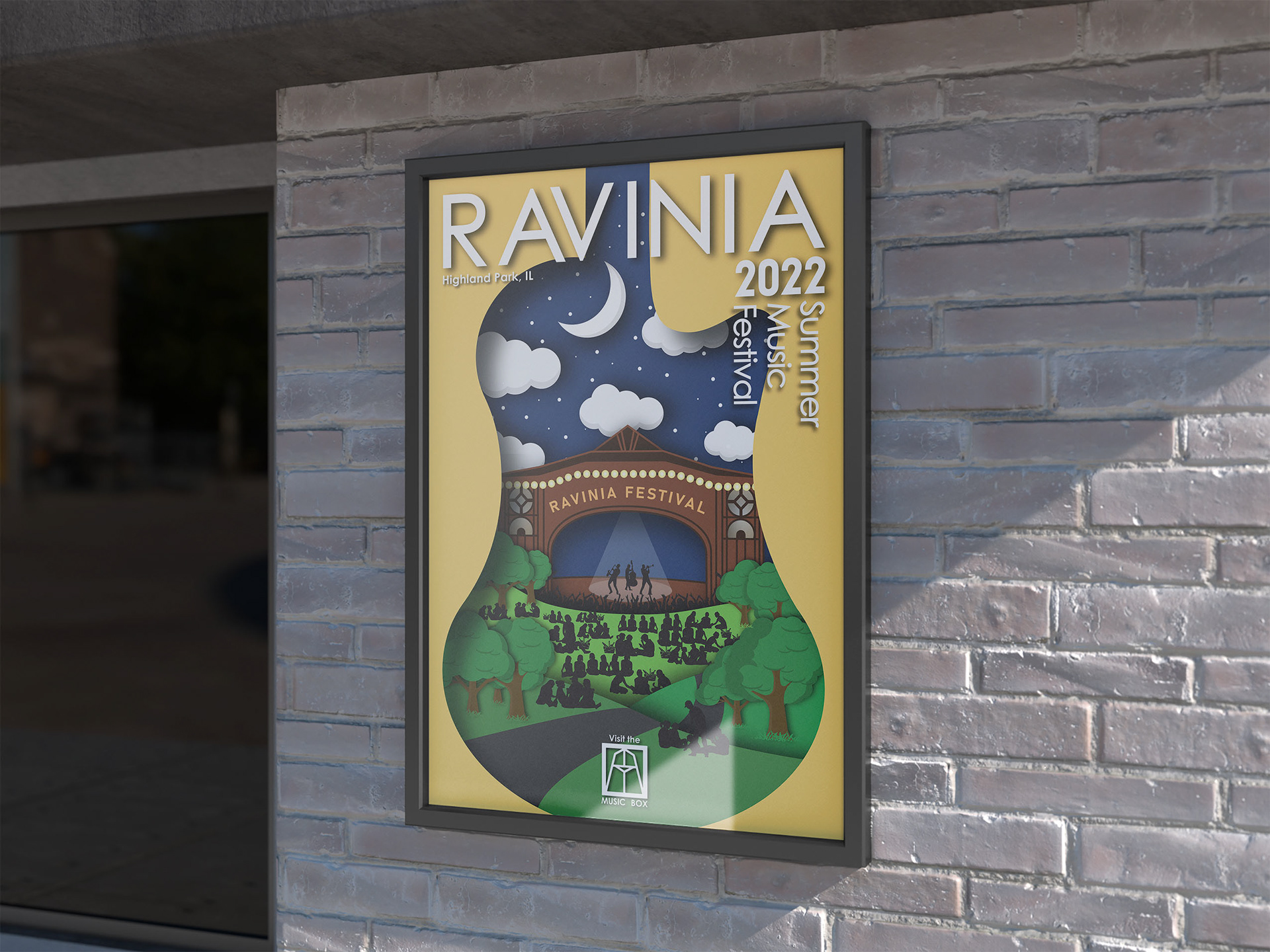
In one of my graphic design courses we were tasked with creating a composition for Ravinia's poster contest. My goal was to create the chill, picnic vibe that Ravinia is famous for. The other major style I wanted to achieve was a paper cutout feel. The brown gate in the middle of the piece is a staple structure of the property and is recognizable to anyone familiar with Ravinia.
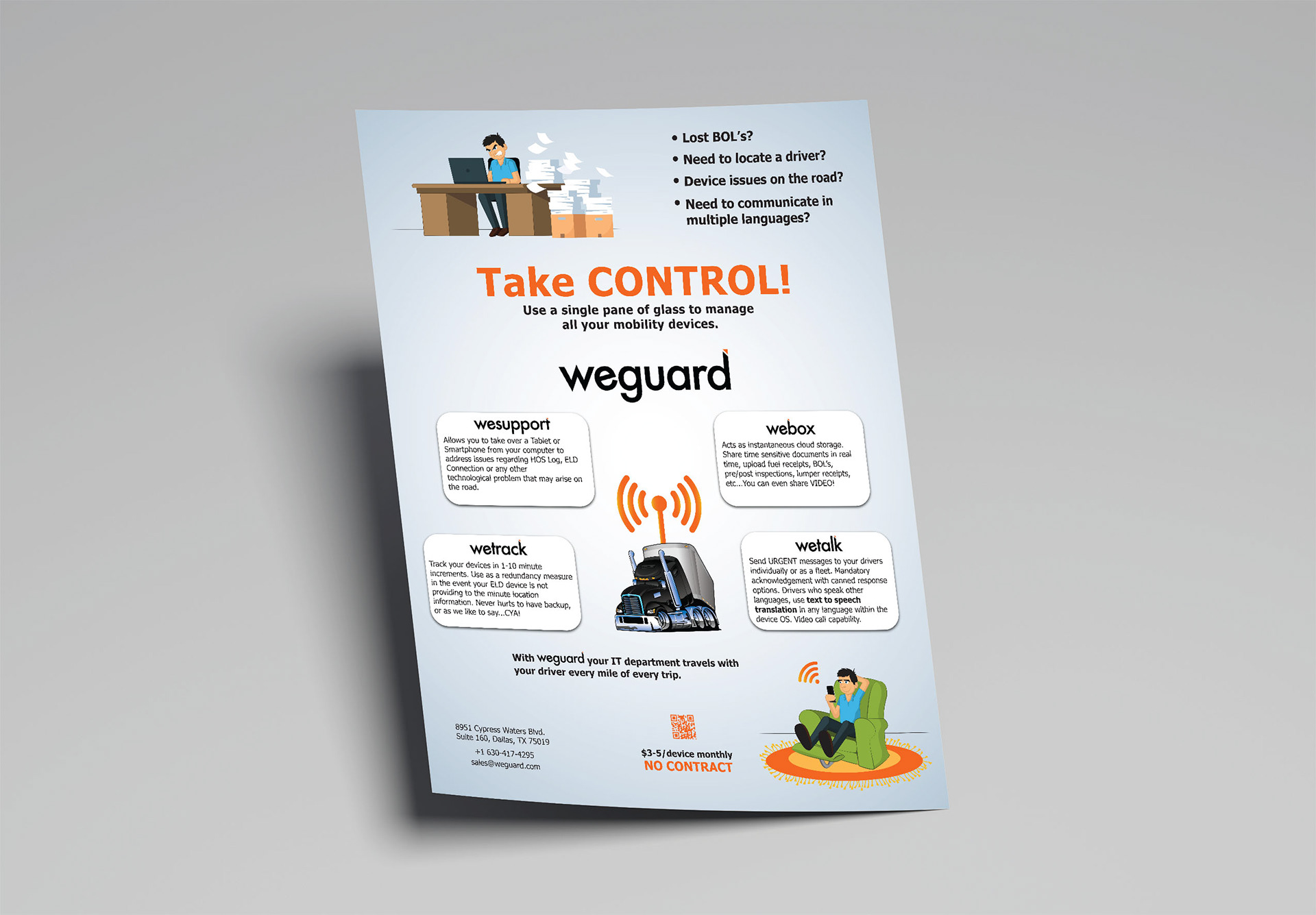

Weguard Marketing Flyers
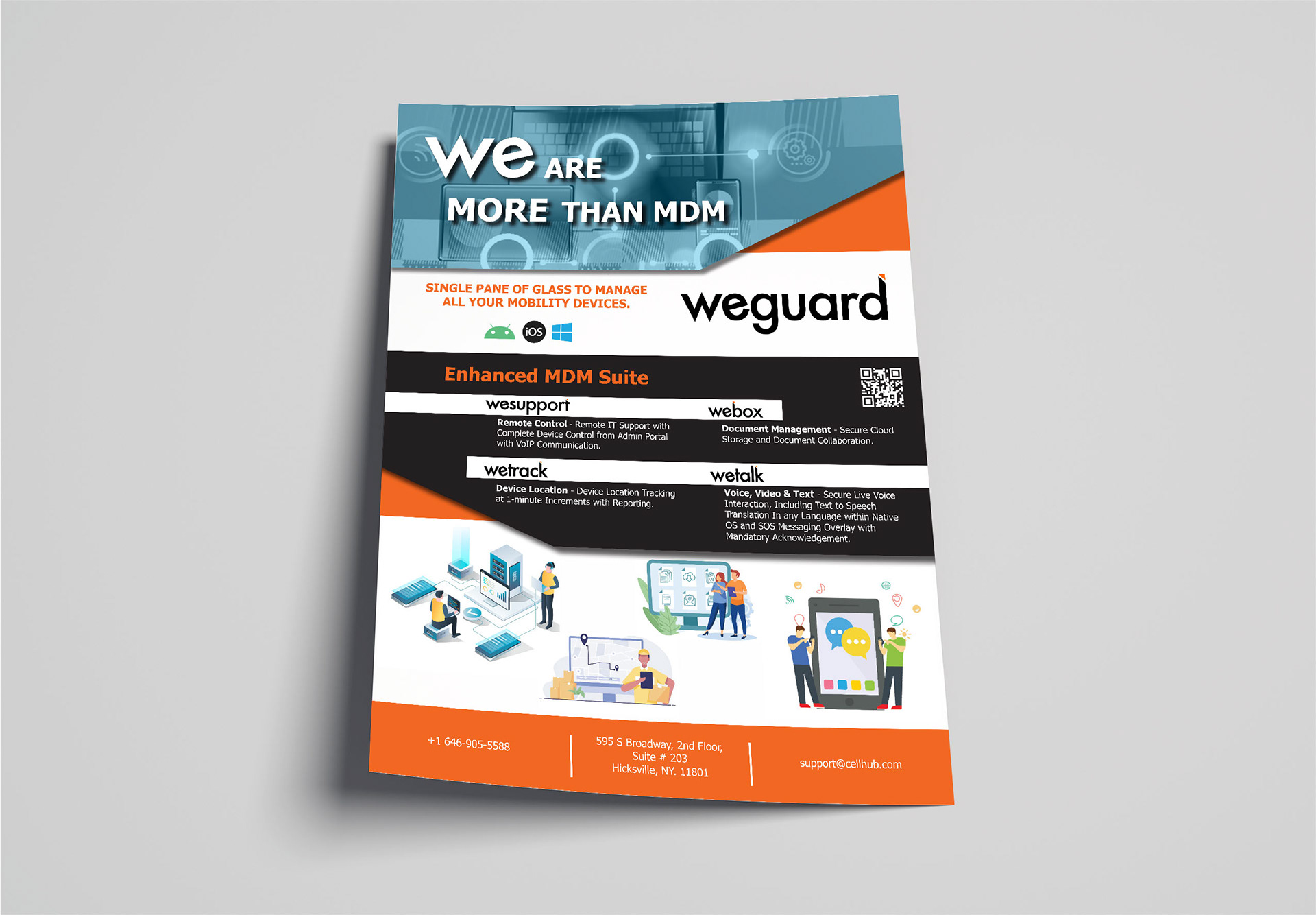
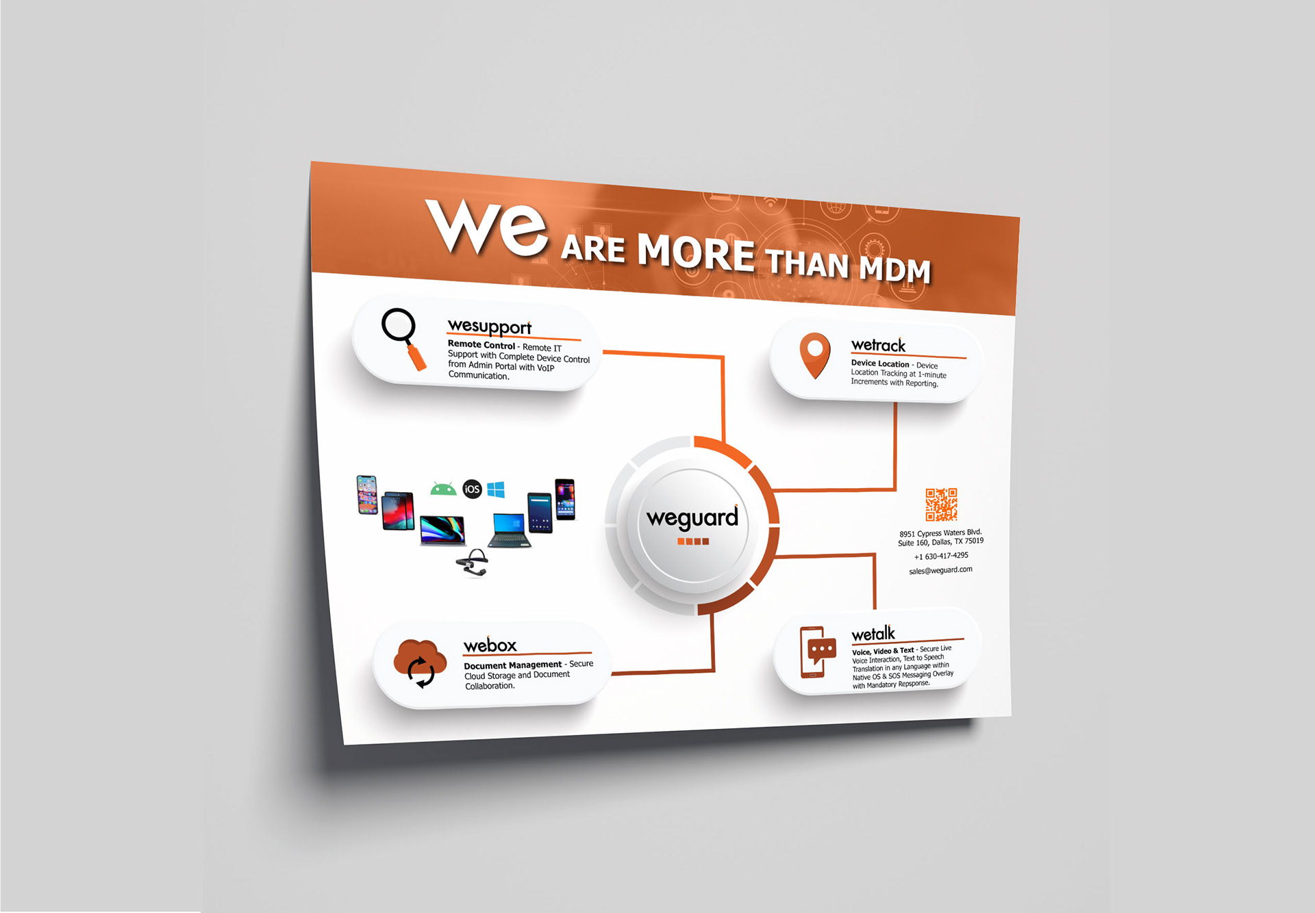
This client sells mobile device solutions for businesses in need of IT on the go, asset tracking, document share & management, and multiple forms of staff communication. The "More than MDM" flyers are more general in their target audience, where the "Take Control" flyer is specifically geared towards the transportation industry.
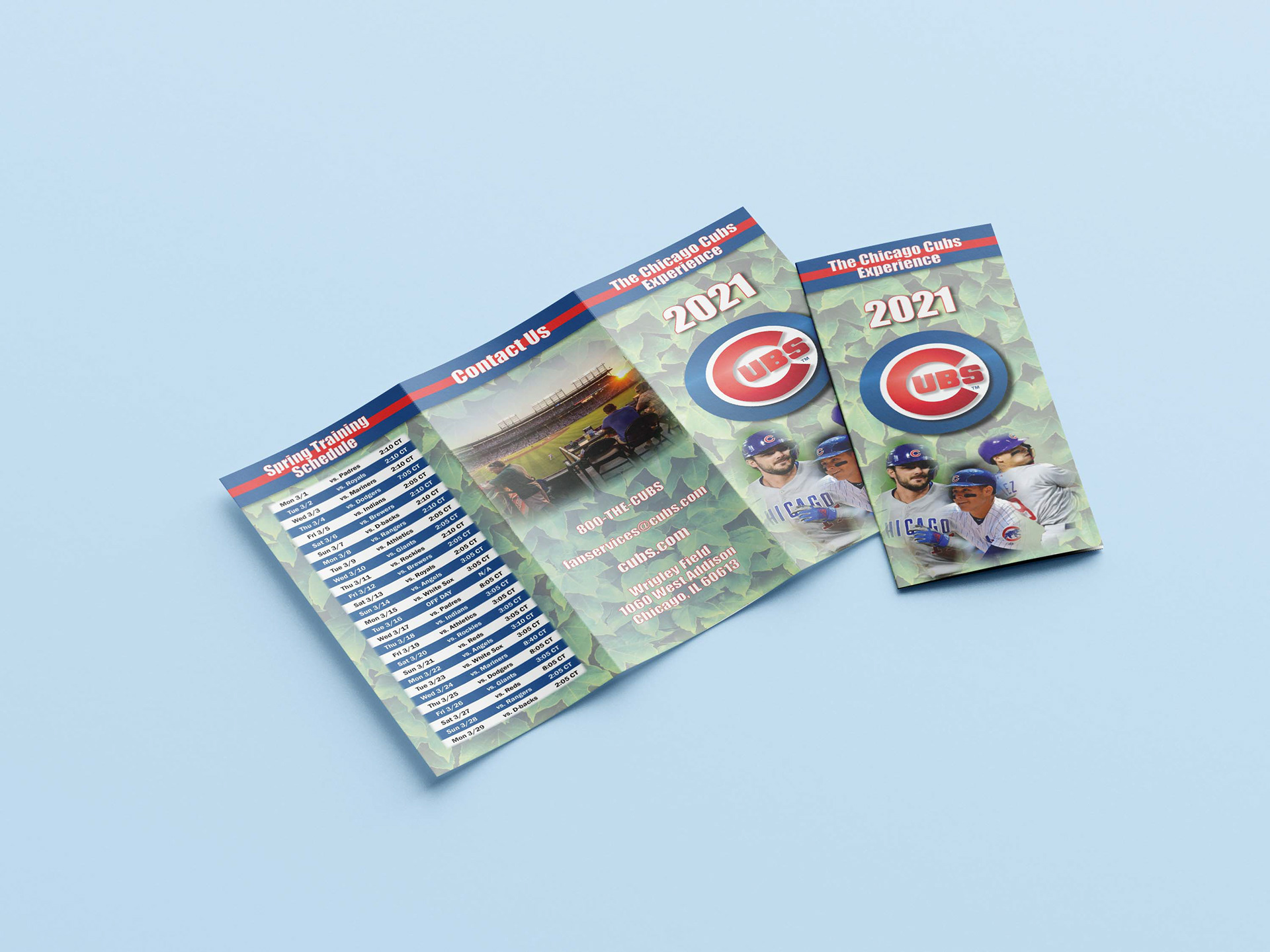
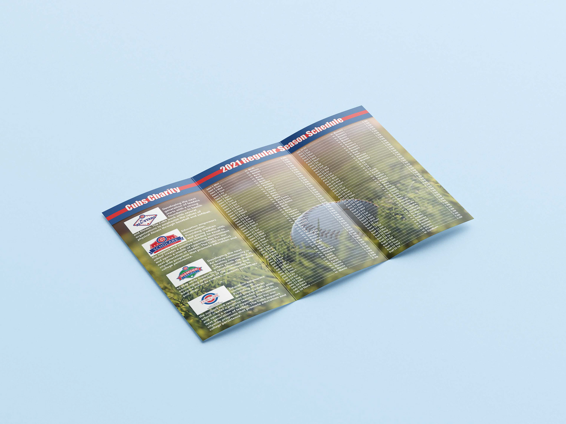
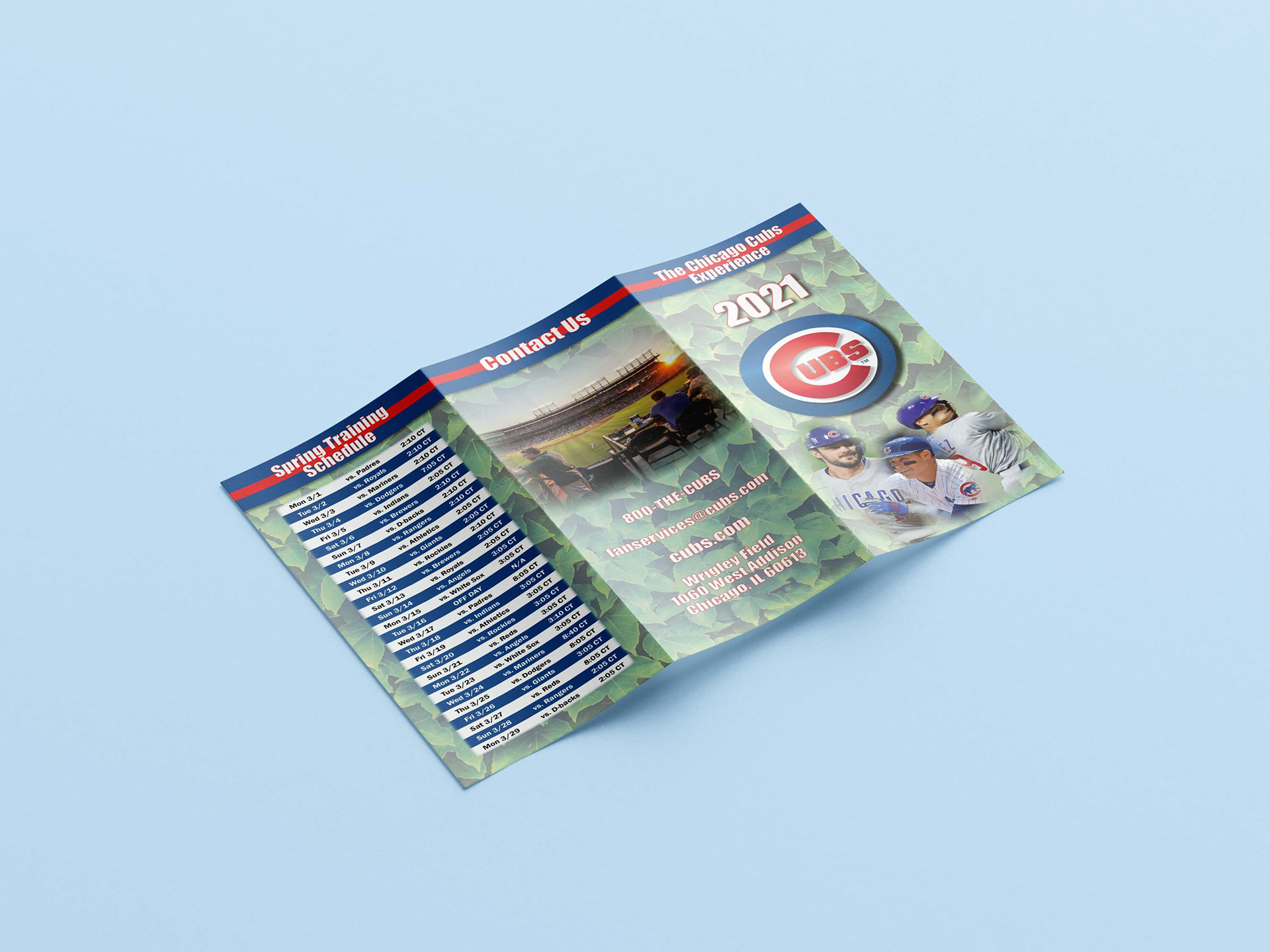
Tri-fold Brochure - Cubs 2021 Spring Training & Regular season schedule.
This brochure was an assignment that needed to incorporate the spring training and regular season schedules, how to purchase tickets, and information on the current charities available through the Chicago Cubs organization.
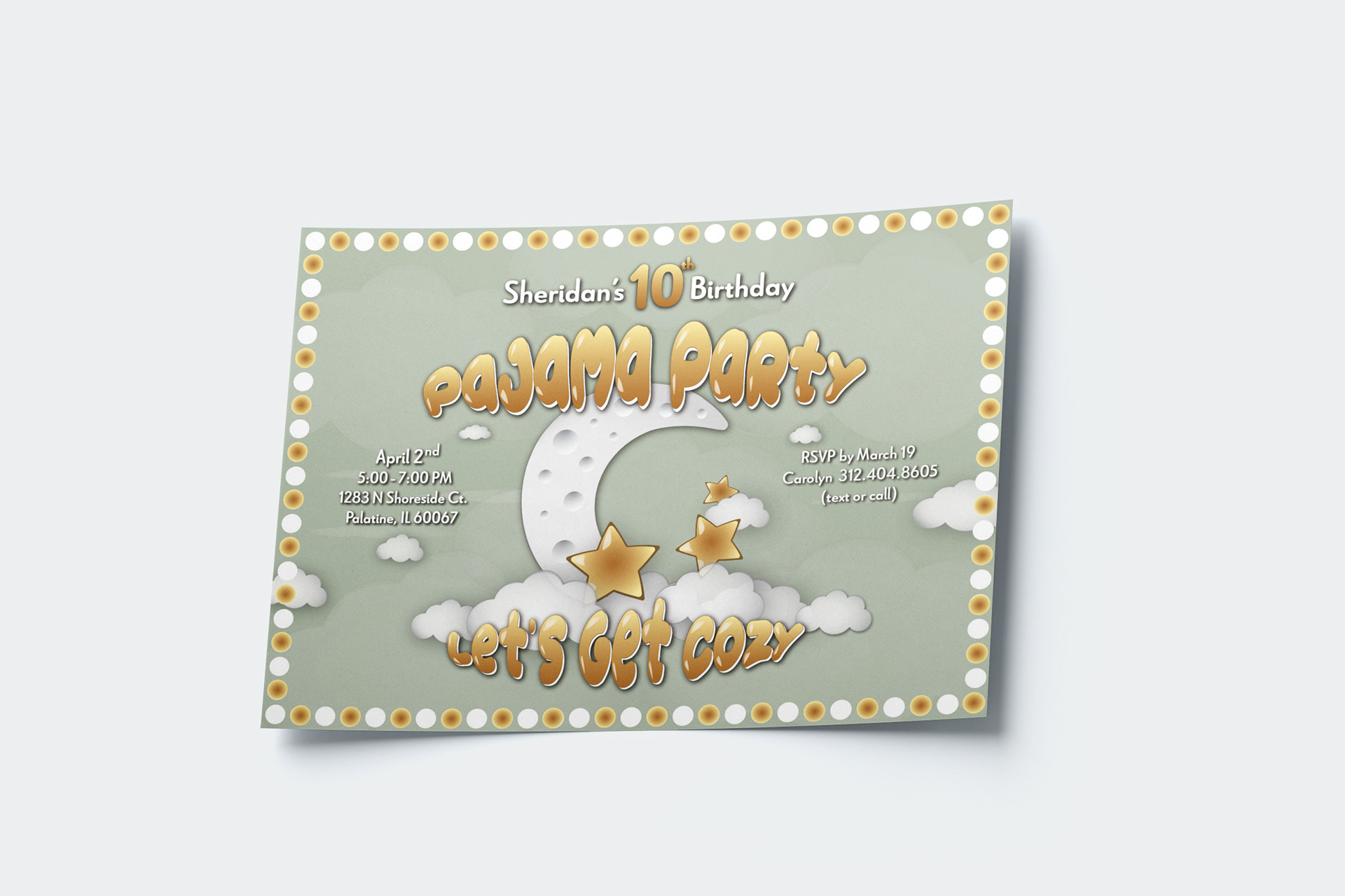
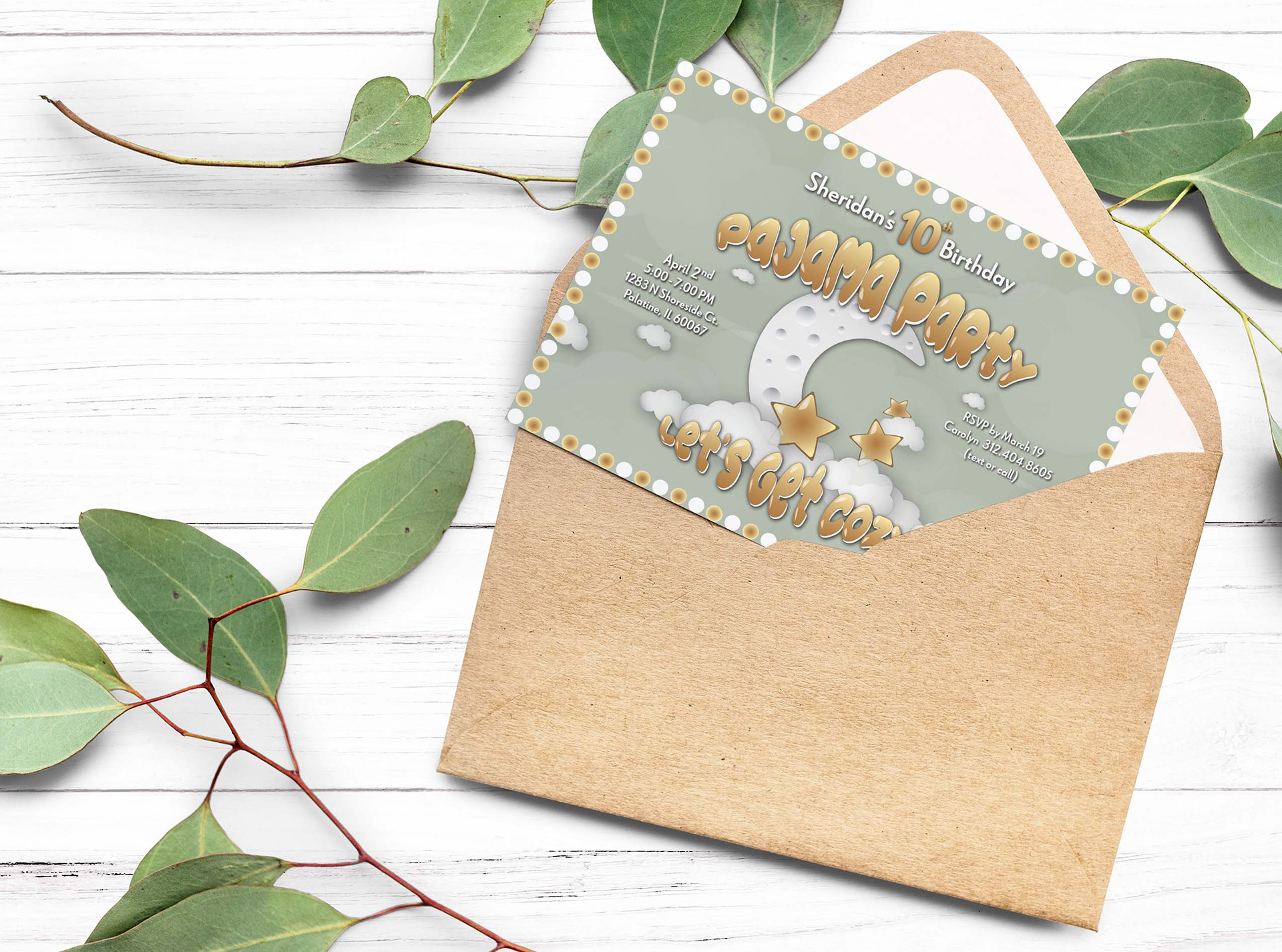
Birthday Invitation
This was a great project! I was commissioned by my daughter who had already picked out her color palette, a rough layout, font style, and tag line. I was extremely impressed to say the least. The imagery was inspired from her birthday cake that included the moon, stars and clouds.

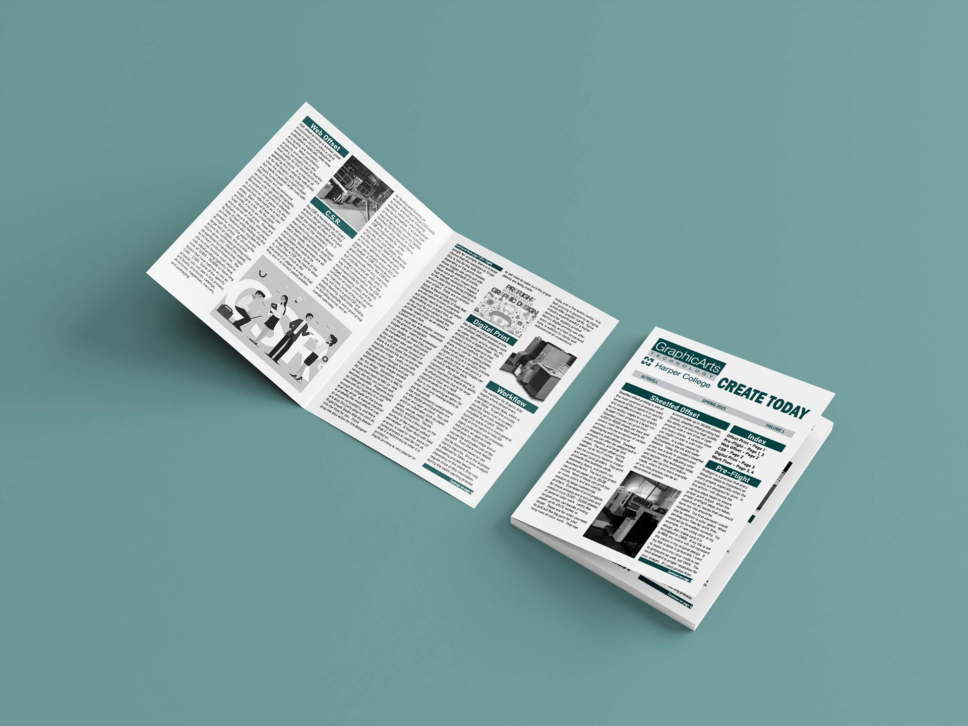
College Newsletter
This was the final project for a graphic design class. We were to create a newsletter for the school, that covered the content of our lectures throughout the semester. The articles included were written collaboratively and individually. The images were required to be exclusively black and white because we were only allowed to use 2 pantone colors.
Annual Christmas Tree Catalog
This client was under an extremely tight timeline and needed a catalog for their wholesale Christmas tree business. Given the time constraints and nature of the client's customers, a simple design was needed. In the wholesale world of Christmas trees, it's about quantity of trees and quality of needles, not décor. The simple black and white design allows the reader to immediately find the information they need for their purchase. I used a combination of Adobe Illustrator, Photoshop, and InDesign. Lastly I created an animated catalog through FlipSnack.
